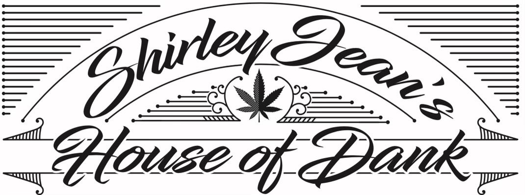
Brief: The objective was to create a logo for Shirley Jean's House of Dank that combines vintage typography with modern cannabis imagery. The design needed to evoke a sense of tradition and quality while clearly representing the brand’s focus.
Challenges: Integrating cannabis imagery in a way that complements the vintage style without appearing out of place. Ensuring the typography is both stylish and legible.
Goals: To establish a distinctive and memorable logo that conveys the brand's identity and appeals to its target audience.
Unique Solution: The design features elegant, flowing typography combined with clean, symmetrical lines and a central cannabis leaf. This blend of vintage elements with modern imagery creates a unique and appealing logo that stands out.
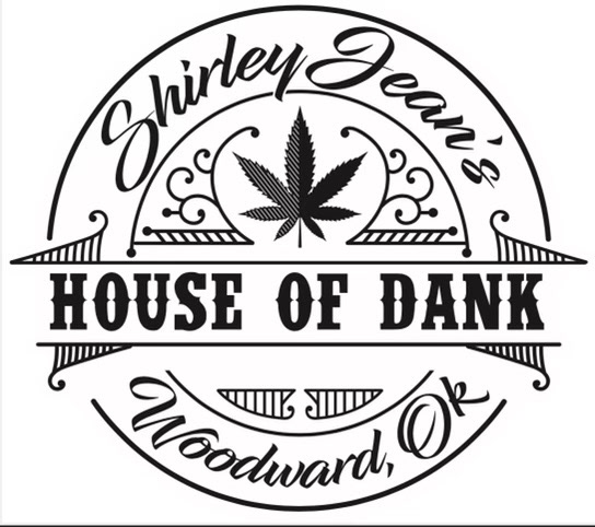
Brief: The brief for this iteration was to refine the circular logo design to create a more balanced and cohesive look. The design needed to incorporate additional details such as the location of the business.
Challenges: Balancing the additional text and decorative elements without cluttering the design. Ensuring the overall composition remains harmonious and visually appealing.
Goals: To create a well-rounded logo that effectively communicates the brand’s name, focus, and location while maintaining a stylish appearance.
Unique Solution: The circular design features a bold central cannabis leaf surrounded by decorative elements and vintage-style text. The inclusion of the business location, "Woodward, OK," adds a personal touch and enhances the local appeal. The design achieves a cohesive look by carefully balancing text and imagery.